Let’s be honest — we live in the age of the scroll. People skim, swipe, and move on in seconds. With most users browsing directly from their phones, your website needs to be mobile-friendly enough to capture attention instantly, deliver value fast, and keep visitors engaged.
If your site loads slowly, is hard to navigate, or doesn’t display properly on mobile, users will leave — and Google will take note.
That’s why mobile-friendly web design isn’t just a passing trend — it’s a must for both SEO and a seamless user experience (UX).
In this article, we’ll explore why mobile optimization matters more than ever, how it influences your Google rankings, and what you can do to ensure your website stands out in today’s mobile-first world.
Table of Contents
Why Mobile-Friendly Web Design Matters More Than Ever
Think about how you browse the web. Chances are you’re doing most of it on your phone — while waiting in line, sipping your morning coffee, or lounging on the couch. Mobile browsing isn’t the future — it’s the present.
In fact, over 60% of all web traffic now comes from mobile devices, and that number continues to climb. If your website isn’t optimized for smaller screens, you’re immediately alienating more than half of your potential visitors.
A mobile-friendly website adapts seamlessly to any screen size, ensuring every image, button, and block of text displays correctly. It’s about creating an intuitive, frictionless experience that keeps users engaged instead of frustrated.
Google’s Mobile-First Indexing: What It Means for You
Google has made it clear — mobile-first indexing is the new standard. This means Google primarily uses the mobile version of your website for ranking and indexing content.
In simpler terms, if your mobile site isn’t up to par, your rankings will suffer — even if your desktop site looks perfect.
Here’s what this means for your SEO:
Content parity matters. Make sure the same valuable content, images, and metadata appear on both mobile and desktop versions.
Fast loading speeds are critical. Slow sites frustrate users and send negative signals to search engines.
Responsive design is key. Google recommends responsive web design because it ensures a single URL and consistent HTML across devices, making crawling and indexing easier.
So, if you’re still prioritizing desktop design and treating mobile as an afterthought, it’s time to reverse that mindset.
The Connection Between Mobile Design and User Experience
A well-optimized mobile website isn’t just about fitting content into a smaller space — it’s about understanding how people interact with their devices.
Users on mobile behave differently: they scroll vertically, use their thumbs for navigation, and expect information fast. They don’t have the patience to zoom in, pinch, or deal with cluttered layouts.
When your website anticipates these behaviors, visitors stay longer, click deeper, and are more likely to convert.
Here are some examples of how mobile-friendly web design improves user experience:
Faster Load Times – Users get the information they need instantly, without waiting or frustration.
Simplified Navigation – Large buttons, clean menus, and intuitive layouts make it easy for users to find what they need — fast.
Readable Content – Short paragraphs, legible fonts, and clear calls-to-action guide the user naturally through the page.
Touch-Friendly Design – Navigation feels natural and stress-free, avoiding mistakes like accidental clicks.
- Trust Through Design: A polished mobile interface signals professionalism and reliability, which are critical for conversions.
SEO Benefits of Mobile-Friendly Web Design
You already know mobile optimization is great for users — but it’s also a powerful SEO booster. Here’s how:
1. Improved Search Rankings
As mentioned earlier, Google favors mobile-friendly websites in search results, especially for users browsing on mobile devices. A responsive design ensures your site meets Google’s usability standards, which can directly boost your organic visibility.
2. Lower Bounce Rates
When visitors can’t easily view or navigate your website, they leave — fast. This sends negative engagement signals to Google, which can hurt your rankings. Mobile-friendly design keeps users engaged and encourages them to explore more pages.
3. Better Page Experience Scores
With Google’s Page Experience Update, factors like mobile usability, loading speed, and interactivity now play a larger role in determining rankings. A responsive, well-performing website checks all the right boxes.
4. Increased Local SEO Performance
Mobile users often search for local businesses — “near me” searches have exploded in recent years. A mobile-friendly website paired with accurate local listings helps your business appear in those high-intent searches.
Ultimately, all these factors lead to what every business wants most — more conversions. When users can easily browse, read, and interact with your website, they’re far more likely to take the next step, whether it’s booking an appointment, making a purchase, or filling out a contact form.
At the same time, when search engines can easily crawl and index your site and recognize these positive user signals, your website ranks higher. More visibility means more traffic — and more traffic means more conversions.
Simple Tips to Make Your Website Mobile-Friendly
Creating a website that looks great and performs well on any device takes more than just resizing your layout. Here are the essential elements every mobile-friendly web design should include:
Responsive Design: Your website should automatically adjust to fit any screen size — from smartphones to tablets to desktops — ensuring a seamless experience across all devices.
Fast Loading Speed: As we mentioned earlier, mobile users won’t wait for a page to load. Compress images, enable caching, and minimize code to keep your site fast and efficient.
Simple Navigation: Keep menus short, clear, and easy to tap. A hamburger menu or sticky navigation bar helps users move through your site effortlessly.
Readable Text and Fonts: Choose legible fonts, use adequate spacing, and maintain strong color contrast so users can read content without zooming in.
Optimized Images and Videos: Ensure visuals load quickly and look sharp on smaller screens. Use formats like WebP for images and responsive video embeds.
Touch-Friendly Buttons: Design buttons and links with enough space around them to prevent accidental clicks — making it easy to navigate with one hand.
Clear Calls-to-Action (CTAs): Make your CTAs stand out with bold colors and clear wording. Place them strategically so users can take action without scrolling too much.
Minimal Pop-Ups and Distractions: Avoid intrusive pop-ups or interstitials that can frustrate users and hurt your Google rankings. Keep the focus on the content.
Accessible Layout: Ensure your website follows accessibility best practices, like using alt text for images and proper heading hierarchy, so everyone — including users with disabilities — can browse easily.
These elements work together to create a smooth, engaging, and conversion-friendly mobile experience that keeps visitors happy and search engines impressed.
How to Test if Your Website Is Mobile-Friendly
To ensure your website is truly mobile-friendly, start by leveraging tools like Google Analytics, Google Search Console, and Google PageSpeed Insights. These platforms provide valuable data on mobile traffic, usability issues, and page load performance, helping you pinpoint areas that need improvement.
You can also use third-party mobile-friendly testing tools — many free online options give instant feedback on how well your site performs on mobile devices.
However, nothing beats testing on real devices. Check your website on multiple smartphones and tablets to see how quickly it loads, how easy it is to navigate, and whether all buttons, menus, and forms function correctly.
Combining these approaches gives you a complete picture of user interaction on mobile, highlighting areas to optimize and ensuring your mobile-friendly web design delivers a seamless, satisfying experience.
Conclusion
In today’s fast-paced digital world, mobile-friendly web design is the foundation of great online performance. It’s not just about aesthetics — it’s about creating an experience that aligns with how people live, browse, and buy.
A mobile-optimized website builds trust, improves engagement, boosts conversions, and strengthens your SEO. In other words, it’s one of the smartest investments you can make in your digital strategy.
As you evaluate your website, ask yourself:
Is it fast enough?
Is it easy to navigate with one hand?
Does it deliver the right message instantly?
If the answer is anything less than “absolutely,” mobile optimization should be a priority — because in today’s digital landscape, mobile isn’t optional — it’s essential.
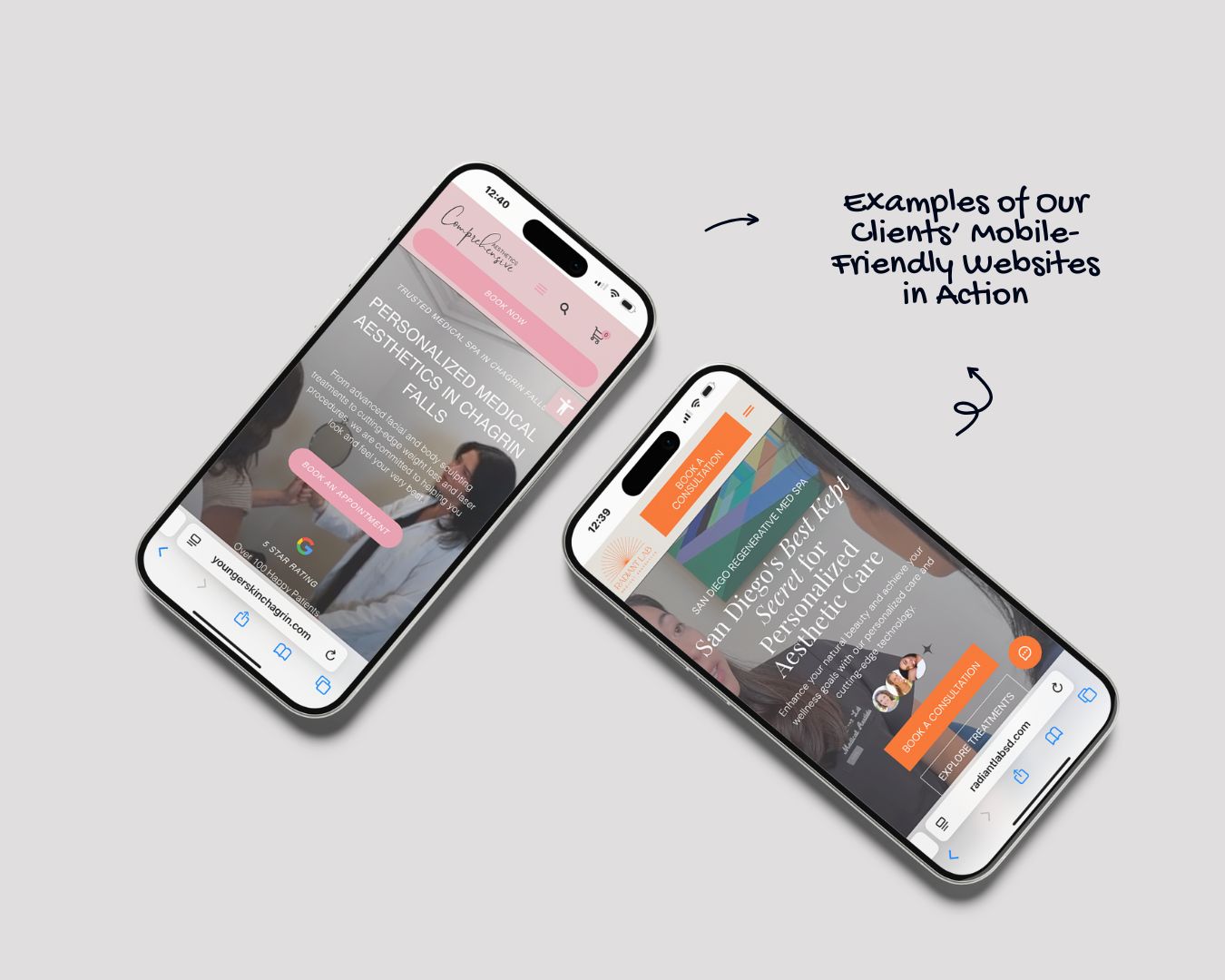
If managing this on your own feels overwhelming, our team at Filia Digital is here to help. We specialize in developing fully mobile-optimized websites with precision and efficiency, backed by proven strategies and years of experience. From enhancing site performance to improving engagement and driving conversions, we focus on creating a mobile experience that delivers measurable results.
Schedule a call with us today to discuss how we can elevate your website’s performance and ensure it meets the demands of today’s mobile-first world.